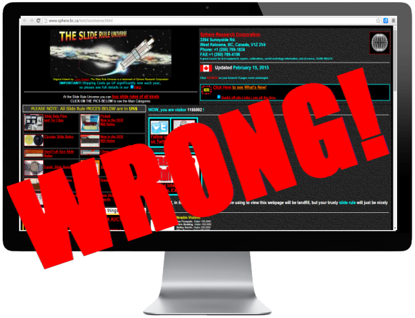
You are making some huge mistakes on your website. Those mistakes are costing you money. As a web developer and web marketing consultant, I’ve complied the five most common errors I see business owners making when it comes to their website.
Mistake #1: Not Using Your Website as a Marketing Tool
Most business owners do very little with their website. For them, it’s just a place to send customers who want more information. It’s little more than a fancy online brochure, circa 1995 web design. There are many ways you can engage consumers on your website, yet I see so many of them that are static and lifeless.
Today, consumers expect a lot from your online presence. In my company, we’ve tested many different website designs and we’ve found that a site doesn’t have to have all the newest bells and whistles to be effective, but the information does need to be current, relevant and compelling. The design and layout is a reflection of your company and consumers will make a judgement based not only on the information you provide on your website, but on how it looks as well.
Most importantly, your site is a tool to drive business. It should engage the consumer and answer the important questions they have, always leading them to a conversion. A conversion is the goal you have for the site. Is it to make a sale, entice the consumer to call your office, fill out a web form or perhaps sign up for a newsletter? Determine what your conversion is and build your site around achieving that goal.
Most of all, use your website to engage the consumer. Encourage reviews and comments on your blog. You can create contests and fun trivia. Link from your social media platforms such as your Facebook fan page and Google Plus account.
TIP: Your website is not a place for you to try to be different or to express yourself creatively. Everything needs to be where the visitor expects it or they’ll get frustrated and hit the back button. The navigation goes at the top, not on the side or in the middle. Resist the urge all business owners have to make their logo big and bold. Keep it small and in the top left corner of the page. Your main content area is in the middle of the page with a big, compelling headline. Your call-to-action should be a quarter of the way down the page and on the right. Make your website easy to navigate and your visitors will stay longer – perhaps long enough to buy something from you.
Mistake #2: Not Designing for User Experience
When a business owner decides to design or redesign the company website, he or she almost always does it wrong. This happens for several reasons, but often, it’s because the wrong person is in charge of the design project—namely, you.
Controlling business owners want to promote a specific image for their company. This image is usually based on past accomplishments, awards, history, personnel, experience and even unsubstantiated design preferences – all the things most consumers could care less about. This happens because it’s very difficult for business owners to see themselves as anyone, but themselves. It’s even harder for them to understand what it’s like for a consumer to visit the site for the first time, not knowing what the owner already knows.
If the wrong person still insists on designing the site, it’s important to design for consumer experience, not owner preference. Find out from your customers what is most important to them. Don’t assume. Every Time I have clients go through this exercise, they are always surprised from what they find out. Owners who have been in business for twenty years finally learn what motivates their customers to buy, simply by asking them. You have to ask. Then, give them what they want.
You’ve heard that in business, you should always sell benefits to the consumer, not features of your company, right? Same goes for your website. Consumers don’t care how long you’ve been in business, how good your people are or what certifications you have. They care about themselves, not you. They want to know how you are going to solve their problems. They want to know what kind of deal they’re going to get. That message has to be front and center on your home page.
TIP: Deals are great. We’re Americans. We love getting a good deal, but don’t build your business by having the lowest price unless you actually have the word “Discount” in your company name. Price is not a marketing strategy, it’s a cop-out tactic used by the noncompetitive. You sell a good product or service. That’s worth something. You have to convince customers why paying a little more for quality is in their best interest. You can do it.
Mistake #3: Not Making it Easy for Consumers to Buy from You
For heaven sakes, put your phone number in plain site. Plaster it all over your home page so your visitors can find it. Have a strong call-to-action button that tells consumers exactly what to do next. I can’t believe how many websites I visit that leave me scratching my head. Where’s the Buy Now button? How do I purchase this product? How do I get a hold of a sales person?
There is a common rule in web design to never let your visitor think. If they have to think too much, they’re going to bounce off your site and right into the lap of your competitor. Everything on your website should be intuitive. If you want your visitor to go to another page on your site, then make sure you tell them to do it. If you want them to call you for pricing, then make sure your telephone number is big, bold and clearly visible.
Mistake #4: Using Images Incorrectly
Images on your website are important. They help to support the content and they break things up in a nice way. Content is very, very important, but most consumers don’t like to read too much (until they find exactly what they’re looking for). They skim. A good way to help get your point across is to use bullet points and bold titles. Another good tool is images, but most websites have the same, boring stock photos that are meaningless to consumers.
I’ll say it here, “Don’t use stock photos.” Consumers want real images of real people. They want to see happy, smiling employees. If your picture looks like a mug shot or your employees refuse to smile for the camera, don’t use them. You need to be approachable. If you show an image of a customer, it ought to be a real customer. It’s fine if the image isn’t perfect and looks like you took it with your iphone. Consumers appreciate the authenticity.
Don’t use images just for the sake of having an image. Make sure they are relevant and support the topic. Images help make your message stronger and can really drive home certain points.
Finally, there is a lot of debate among web developers about the use of sliders. Sliding images on your home page can help you communicate several important messages in the same space. The problem is that most visitors don’t wait around for the second or third slide. They start scrolling and then the sliding images just become a distraction at that point. Personally, I prefer one static image on my home page. If I want to make several points, I can use animations – text that overlays the image and changes to promote different topics.
If your business is small and your niche narrow, then I would definitely use only one image at the top. Our testing shows that a large image of a face either looking back at the visitor or at a line of text is the most effective. Consumers love big images right now.
For large corporations and organizations with a lot of different focus areas, a slider may be the way to go in order to cover all those areas, but as a general rule, I usually discourage my clients from using a slider on their home page and absolutely never on a landing page. A landing page needs to be narrowly targeted so no sliding images. Go it?
Mistake #5: Not Using Your Analytics for Deep Insights
If you are not measuring user activity on your website, you are leaving a lot of money on the table. Why wouldn’t you measure? You can gain more insights about your customers’ buying behavior than you ever have before and with Google Analytics, it’s all free information. These are insights and data that even the biggest corporations in the world didn’t have access to just ten years ago. Now you do.
Find out what pages your customers stay on and which pages cause them to leave. Find out where they are coming from and how many pages they click on. How many visitors added a product to a cart, but abandoned the check out? Knowing this behavior can be the difference between business success and business failure. If you are not using your data, go to Google Analaytics now and sign up for free. If you can’t do it, then get your web developer to do it for you. He or she will be able to tell what the data means and how to use it to increase sales.


